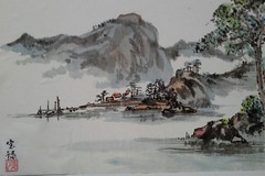
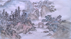
Chinese landscape painting is referred to as "mountain-water" in Chinese. Clearly water is an important element. Water serves many functions. A calm lake can expand the space, and calm the mind as in the current picture.
Here, the lake is calm, but not a still calm. We can tell from the reflections. As there are minor waves in the water, the reflections of the shore objects are broken up, as in the boat's mast. Near the shore, the water is rendered by a series of "dragging" strokes, pointy at both ends and wider in the middle. A few of them together gives the idea of calm waves.
For the shore in the foreground, we use similar strokes to provide the water. These are like reflections of the sky. Reflections of the rocks themselves require a more definite form. This is done by a sideways application of the brush.
The composition leads the eye to the far shore overshadowed by high mountains. A classic "mountain-water" idea.
Wednesday, November 6, 2013
Waves on Calm Waters
Saturday, November 2, 2013
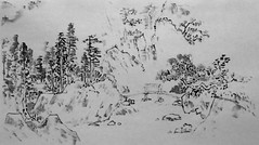
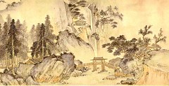
A Looser Style Painting
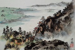
A complement to the traditional style would be the free style -- a spirited and loose approach to paint. A good command of brush strokes is required, so that lots of variations are incorporated in each stroke -- variety in shapes, ink tones, wet- versus dry-brush etc.
In the current picture, those strokes build the landforms in the right side. Then a loose and lively effect forms the left. This was done with a crumpled lump of tissue paper in a type of dabbing action, resulting in a natural irregular pattern. Then careful strokes render the temple, the trees, the boats and the distant landscape. An application of color finishes the picture.
Friday, November 1, 2013
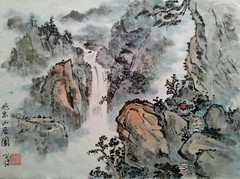
Waterfall Picture in Traditional Style
Saturday, October 26, 2013
Final version of the Dai Jin painting
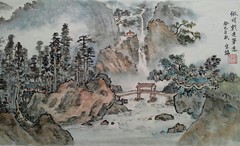
Then after the latest paints have dried, we wet the whole paper, blotting away excess water, to produce a uniformly damp substrate. Then we do a "wet-wash", which provides a very soft and even coloring. This brings out the mist/fog by coloring its surroundings --otherwise the mist's white (the blank space) will not show. We do the water. Note the selective glazing of the water to bring out the sense of flow. We also darken the foreground some, and voilà!
Thursday, October 17, 2013
Dai Jin painting: stage 2.
Stage 2 will comprise of selectively strengthening the edges between layers of scenery, by darkening of lines, or new dark lines, and/or dots. Then when dry, add color. When glazing on the color, use a brush stroke consistent with the texture or lay of the object. Thus, if the rock runs at some angle, glaze in the same direction.
Typical colors: For rocks, mix brown and blue. The bright side of the rock, use brownish tint. For the shadow, use bluish tint. Tree leaves, use yellow mixed with black.
Make sure the colors are well mixed and dispersed. They should be a dilute mix. Intensity is built up by repeated layering of colors. If you color too intensely in one go, it will look too stiff.
As for the interface with the fog or clouds, use a dry brush to provide an irregular edge. For the edges of the waterfall, also use a dry brush, to ensure no bleeding into the waterfall, which must be kept white!
See my version of coloring is as a guide.
Keep in mind there is still stage 3, which is a wet wash process, to come.
Wednesday, October 16, 2013
Doing the Dai Jin painting
A few blogs ago, we showed a section of a painting by Dai Jin. Here we discuss how to proceed with creating a version of it. To start, it's best to begin with ink of light to medium intensity. That way, we can make modifications or augmentation later with darker ink. Start at the most prominent feature in the middle section of the painting. It is the large boulder. The rest will build up from there, and will be scaled and positioned relative to it. My rendition, the first stage is attached --as a guide to show the ink tones and the degree of development appropriate for the first stage. Again, certain parts will be darkened, and details added in later stages.
Thanksgiving Greetings
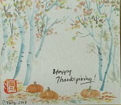
We have been having a really fine October here at the Lower Mainland of BC. Dry! Bright foliage! With all different colors, the trees are especially beautiful, each showing its unique shape and stance. Wishing all a happy fall season.
Tuesday, October 8, 2013
About Rocks

The upper part of the figure shows on the lower left a pile of 5 rocks rendered as above, with the outline stroke providing a series of different shapes -- round, square , angular etc. Note also that the five are lined up in a lively manner, i.e., irregularly. As we move to the right, we dissolves some of the top edges of each rock. In so doing, the rocks merge into one big complex shape (the middle figure). This shows how a series of incomplete edges and textures can form a complex shape.
A more lively rendition will be doing the shades and texture first, and then outlining the edges, as shown in the rocks on the right. A free-style brushwork renders the shades in an irregular way, the edges are placed to include the white space into the rock.
Whether the pile of shapes are rocks or mountains will depend on the context, i. e., the surroundings. In the top, I added trees, a building, and some boats. Then the same shapes turn into a mountain overlooking a lake!
Monday, September 23, 2013
Dots -- tree leaves and beyond
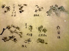
Clusters of 5 arranged like the petals of a flower are in the upper right. Note the 5-configuration can have variations in itself, some arranged in a round pattern, some in a flat pattern. I also show this pattern crowning the rocks.
Vertical dots dots are shown next. These are best done using a very dry brush with bristles somewhat splayed. The stroke starts off heavy (top) and ends light (bottom). Then one can go over them with lighter ink strokes to give depth (after the strokes have dried). This is the common practice to give depth. The horizontal dots can be done as a dragging motion of the brush at a shallow angle, again with a dry brush. Going over with light ink again adds depth.
A few final words. Vary the pattern. For the 4-cluster, vary the orientation, length, width of the 4 strokes For flower pattern, vary the arrangement as discussed above. Vary the ink tones. Vary the size and width; (vary the pressure of the strokes and wetness and ink content in the brush). In dotting a tree, the dots at the periphery of the tree are most important. They show the most clearly, and should be done with more care.
Dots -- tree leaves and beyond
Then there are the overhanging trees in the upper part of the picture. One has vertical strokes for leaves, and the other has horizontal strokes. These are typically done with a dry brush, with the bristles somewhat splayed apart. Note that these linear strokes fall also under the category of dots. "Dots" in Chinese painting is a broad concept.
In the next blog we discuss how to do these dots.
Saturday, September 21, 2013
Happy Autumn 月是故鄉明
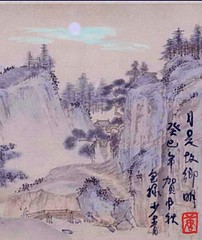
To celebrate the Autumn Equinox, and the Chinese Mid-autumn festival, and to welcome in the fall Chinese Painting class at Kensington, here is a landscape with a moon added. The original painting was by Dai Jin 戴進, from the Ming Dynasty. Titled "Ten thousand leaques of the Yangtze River 長江萬里圖", it is a long scroll with a long horizontal continuous scenery. I extracted a small segment, added the moon and calligraphy, and imbued it with a blue hue using Photoshop Touch on my tablet. Just for fun 贺中秋!
Tuesday, September 10, 2013
Using the Samsung Note 10.1 for quick sketch
One key attraction for this tablet is the touch-sensitve pen integral to it. The pen works well. It can produce lines with flow and energy! This sketch took just minutes. The red and the black go well together, very bold and sharp.
Sunday, February 10, 2013
Happy Year of the Snake
Wishing everyone a successful new year, with good health and happiness.

Monday, January 21, 2013
Adding Colour to Painting

Sunday, January 20, 2013
Doing Rocks and Landform
After the outlining, texturing and dots, colour will be added. The very distant mountain is done with a broad stroke.

Saturday, January 12, 2013
Class of Winter 2013


